
For my multimedia project I was hoping people will learn the benefits of mindfulness. I have found throughout my university degree that there is a lot of stress that comes with school. Life can be overwhelming for students as they navigate their time in and out of the classroom.
The multimedia learning object I am using again is an infographic. I have enjoyed making these for this class as well as in my others. This is the infographic I chose to work with again as I received the most interest in this blog post. Each of the comments said they enjoyed the design choices and they were easy to read. When showing this infographic to my grandma my infographic she has a hard time reading the white text. I decided to change the background colour from light yellow to the rust colour.
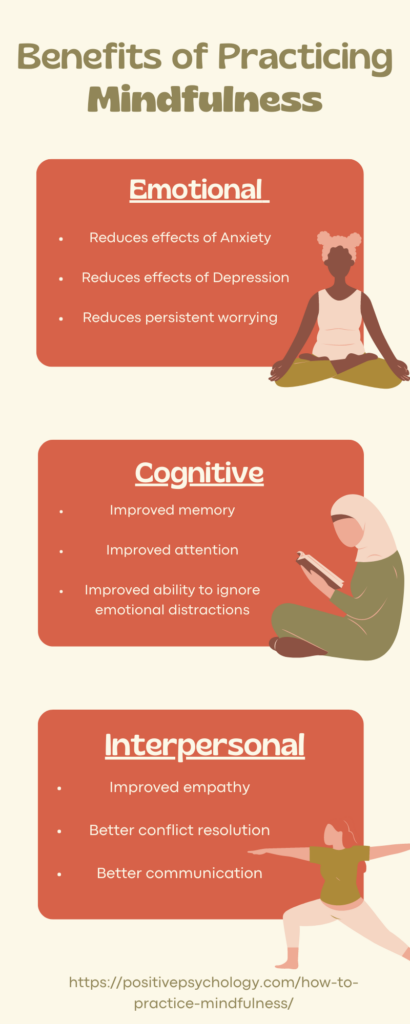
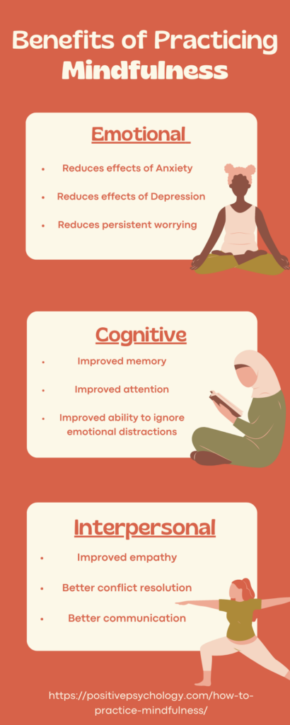
Again keeping the colours simple in the second version of the infographic. Keeping consistent style choices and fonts was another rule I followed. There is only one font used throughout the infographic. I chose to made some words bold and some underlined and used contrasting colours to make sure the text stand out.
I did not upgrade too much in the infographic as I followed using big fonts, spacing, and colour contrast, all guidelines for creating a UDL.