This week I chose to make a infographic with Canva. I enjoyed how easy Canva made the process of creating my work. The site recommended the colour palette of the imagery which made choosing the colours simple. That is the rule I tried to keep throughout the process. I kept wanting to add more to make the infographic seem more visually intricate. Keeping consistent style choices and fonts was another rule I followed. There is only one font used throughout the infographic. I chose to made some words bold and some underlined and used contrasting colours to make sure the text stand out.
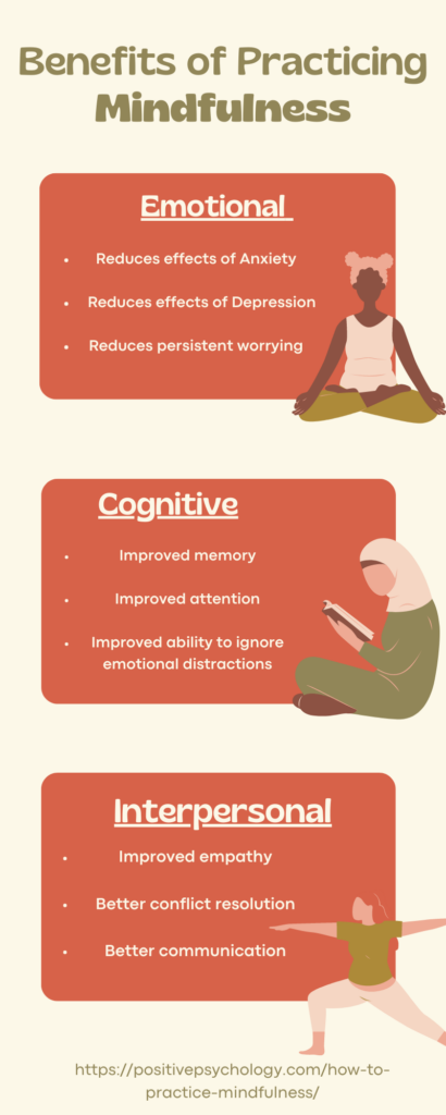
I wanted to make my infographic about mindfulness as I feel it is important especially through the school year. We students have learned many tools over the years such as deep breathing, stretching, and meditation. Knowing the benefits is important to keep the motivation going!
justinecook
2022-10-16 — 8:45 pm
Hi Sydney! I love your infographic – I appreciate your use of muted colours and tones, it really adds to the calming and mindful theme you have. I agree, throughout the semester it is very important to be in tune with your mental health, especially during midterm season. I’m curious to find out how your journey to mindfulness started, and how it became such a priority for you – looking forward to discussing that in our learning pod this week!
sh2001
2022-10-16 — 9:56 pm
Hey Sydney! I have found Canva to be a very useful tool and it was very easy and intuitive to create an infographic. The color you used was very nice as it added a minimalist yet aesthetic design. Many people underestimate the importance of color scheme. The topic you chose was also very relevant because I think many students would find this information helpful, especially during midterm season. Did you also find Canva to be fairly easy to use or did you face any challenges with it?
taniatari
2022-10-17 — 12:02 am
Hi Sydney, I used Canva as well and found it to be super helpful when it comes to creating different types of infographics Also, the colors and tones choices were excellent as they really did add to the calming effect Thank you so much for reminding us as the midterm session approach that we need to take the time to be mindful!
Amelia
2022-10-21 — 10:36 am
Hi Sydney!
Your infographic is lovely! You have designed your infographic to be easy to read using big fonts, spacing, and excellent colour contrast, all guidelines for creating a UDL! Further, your infographic is not too ‘busy,’ making it easy to focus on the information you are trying to get across. Even the images you selected are very calming when you look at them. I wondered what your creative process looked like while you were assembling your infographic. How did you decide what to include in your design? Was it difficult to leave out certain information you would have liked to share? What multimedia principles did you have in mind throughout the creation (ex., Signalling, Coherency, etc…)?
Amelia